Watches Design


For our last lesson on Creative Thinking we were asked to design a watch which is meant to be given to three friends that describes the word pencil, fork and hammer. The picture above was give to me by Thurayya. According to her I was pictured with a hammer on my head making a fool out of myself. Thurayya thinks that I am silly and hammer would perfectly describe me haha. I love how the watch is so cheerful and bright with the striking pink and yellow!

These are all designed by me. The first one was pencil which represents Jie Yi, she is slim and tall just like a pencil. I drew pencil all over the strap of the watch.On the numbers there are decoration of flower petals which aso shows how feminine Jie Yi is.


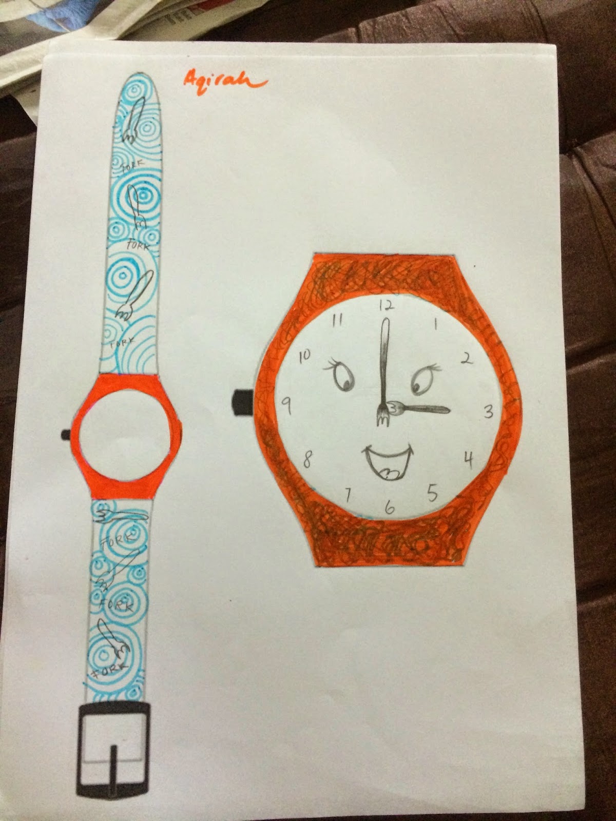
This is made for Aqirah. She is a fork, a friendly one indeed. Aqirah was described by a fork because she loves to share her food with her friends.I have used blue and orange to sketch this design because it compliments with one another.


This is designed for Claris. She is represented by a hammer because she is a loud person who entertains us all the time with her insane behavior. Overall, I enjoyed sketching these design for watches using words like fork, hammer and pencil to describe my friends. Creative thinking is so much fun!


NAFA FUN DAY


On the 3rd October it was a special occasion for the whole school because thank god its Funday!
We went to Siloso Beach and all of us had to do a little morning exercise walking from the train to the beach. It was indeed a funday and as it allows us to have fun and bond our friendship. We played some games and Claris even won a keychain rubic cube haha!


We went to another beach after a while just to hang around. The others decided to soak themselves into the sea. I was a little upset that I have forgotten to pack extra clothes but oh well, dipping my feet into the water will do just fine. Claris bought her ukulele and a plastic mat so that we could sit around and sing some songs. The food provided was alright but after the whole day we ended up still being hungry after all the activities we did that drained our energy.


Look at our happy faces with free cotton candy! It was extremely humid but I was thankful that it didn't rain on that day. That would have ruined the fun.


They even have a photobooth which made us even more excited. There's the picture of us being silly.


So we decided since most of us were still hungry we dropped by a small restaurant which is located at the Dhoby Ghaut mrt. It taste delicious I ordered some Hor Fun noodles to fill my tummy! It was a little pricey but I wouldn't mind going there again. It was a little odd to see lettuce in the bowl of noodles because I have never eaten Hor Fun with lettuce before.

Pastamania!

Earlier on today, my family and I went to Pastamania for my brother's birthday dinner. We sat near the lamps which made it looked like we were eating outdoors. The restaurant was pretty spacious and cozy.


My tummy was grumbling the whole time and it was definitely a call to order the pasta! This was aglio olio. It was the chef's recommendation and for sure we were ordering it. The amount of black pepper in this pasta was just right. 


We also had carbonara which was decorated with parsley. It was so creamy and delicious. 


This was what I ordered which was a beef lasagna. The portion was a not enough for me. I felt the urge to order another one because it was so tasteful. I notice for my beef lasagna that I ordered there was no parsley leaf like the rest of the other pasta. Oh well, maybe they accidentally left it out. I believe that decorations using red or green vegetables do increase the appetite and it is mandatory for it to look more appealing than it is!


This was my brother's plate. It was as amazing as the other pasta we ordered. However there is seafood which made me drool. Look at that clams and squid accompanying the delicious tomato based pasta. Yum!


After consuming all of those delicious pasta, I decided to treat myself a little desert for the night. This was peach yogurt along with peanuts and crushed oreos. It taste a little sour which is all you need after eating a bowl of pasta!

Juxtaposition

On Tuesday after Creative Thinking we had a presentation for our individual projects for 3DF. We were doing a project on Juxtaposition. Juxtaposition happens when two things are in contrast with one another. I did a swing set to show the contrast of modern and traditional. The swing set is made up of wires to show how technology is consuming our traditional games. Nowadays, lesser and lesser children are seen playing on the playground instead they are so attached to the gadgets that are easily available around them anytime and anywhere. Here is my swing set!


 This is done by Tsering. It is a coffin with skull and gold coins. This is interesting as it shows impermanent and permanent. Wealth cannot be brought to the death bed and I feel like it is interesting that wealth cannot be destroyed however life is not permanent and everything that lives will sooner or later die. 


This is done by Claris. It has a little similarity to my model because the metal parts on the other side of her tree symbolizes technology which is having a great impact to our daily lives. Except she is doing on nature vs traditional. The satellite looks so cool doesn't it?!


 This was done by Gwendolyn.


This is done by Thurayya. She is doing a juxtaposition on peace vs war. The flowers symbolizes peace while the gun symbolizes war. 


This is done by Aqirah. It is a rabbit which was made by clay. Aqirah did on animal abuse. There was particular make up brand which uses animal to test their products. On the other side of this rabbit which you can't see in this picture which is made of metals. Those metals shows the suffering of the rabbit and the consequences of animal abuse which is successful in creating an impact.


This model looks so amusing and it was done by Wen Xin. It is a juxtaposition between life and death. The black roses shows death and the newborn symbolizes life. It was created by using clay and paint. Doesn't it looks like an artwork that you see in museums? 


Next, this was done by Carlyn. The book beside the clear folder represents those people who goes to school and really gained knowledge. On the other hand, the clear folder represents those people who didn't gain any knowledge.


This was done by Jennifer. This is a juxtaposition of  beauty and filthy. The lips are beautifully decorated while the the teeth are filthy and filled with dirt. This clearly shows how inner beauty is more important than appearance. This relates to the today's society.


That marks our final project for the class and I have enjoyed making my juxtaposition model even though after facing some difficulties in the process.


Products that we improvised


The other day, we were suppose to improve a packaging of an item that we have chosen. Our group did a packaging for a protein bar. We have discussed and we think that the packaging is not too appealing. The design of the packaging can also be improved by having another image instead of  '+' .
Since it contains mostly various types of nuts such as peanuts and macadamia, we thought it might be more suitable to replace the image design of peanuts instead of '+'.
One of us also mentioned that it was hard to scan the barcode as it is hidden behind the ingredients list. So we improved the packaging to this:

Our group changed the brown packaging because we thought is looks dull and not interesting. Additionally we changed the transparent part of the packaging to make it less visible of its content. The reason is because the protein bar looks undesirably sticky and we felt that we would only allow a little part of it to be seen.


 These are some of our other fellow classmates' ideas of their improved packaging.


This seaweed packaging are redesigned such that it has a seal so that you can keep it and save it for later . You don't have to run around hunting for rubber bands to keep it sealed. Isn't that great? The packaging is cute too!


 Doesn't this look adorable and pretty?! This is done by Safinah's group it is a cake decorating tool. It even has a colourful and cheerfl background.


This is a box of chocolate and the cool part about it is that at the top, it has a tiny circular opening so it avoids pouring out too much on your hand. It does all the control which comes in handy especially when you are offering your friends some of the choco mints.


This is an egg microwave cooker. It works by cracking the egg into the plastic container and it will be cook once you put it in your microwave! This group design a chicken since their product is an eggcooker. 


This group improvised on a packet of potato chips. They made a circular air bag which can be tightened like a lid so it keeps your potato chips crispy like the first time you open it! These are pretty cool because the lid is big enough to put your hand in unlike some potato chips that are stored in those typical circular container which you can barely put your hand in to reach for the potato chips .


So those are what we have designed to improve the packaging of the products! 


Packaging failures and Pastels!

23 September, I went to hunt for packaging that are a failure. This meant that there is something not right about the way it is being packaged. It is quite hard to find these mistakes in packaging in Singapore but I have managed to find some products that I think could be improved.


This chocolate bar which I saw in a mini mart caught my attention. The packaging was too overwhelming and the image is everywhere in the packaging. There is totally no focus and the design is not pleasing to the eye. In my personal opinion this packaging can be improved by having lesser image and a change in the composition into something much simpler. 


Next, I saw this apple juice that was dented. The packaging of the design is alright however, it is the first thing that everyone can see. The seller should not display the apple juice to be sell. It should be discarded no one would want to buy a box of dented apple juice am I right?


This is a microwave egg cooker which packaging isn't proper. Firstly the material of the plastic was too flimsy and it looked really bad in terms of quality. There was no interesting design on the packaging that will capture a buyer's attention. I feel that the packaging could be improve by using a more interesting choice of colour and a better quality of the packaging itself.   


This particular fruit isn't in a package. I took a picture of these pomegranate because they were not in the best condition. As you can see, the pomegranates have scratches and they are not fresh anymore. They should restock those fruits and throw away these ones which look spoiled.  


This is an artwork which I did in NIE whereby we use pastels to create an abstract art piece. The challenge was that our skin could not come in contact with pastel when creating the artwork. I found a technique which I really like which was to shave the pastel and transfer it to the paper to create a dusty effect. I even tried spraying the artwork with water so that the powdery soft pastels becomes more pigmented and thus able to stain the paper more effectively. Doesn't the first abstract pastel work looks like a cloud?


Creating an abstract art work using soft pastels for the first time I think I did a pretty alright job haha!

Faces in everyday object

During Creative thinking we were asked to find faces in daily objects around the school. I managed to find some which I think is quite interesting.Take a look!

As I went out of the class to look for faces in objects I found one on the board which was a timetable. It may not be obvious for everyone but there is a face in the slots of scheduled classes.


Next we went out to the corridor and I see a smiley face on a pole. The two metal sandwiched on the pole looks like eyes to me and the curved metal at the bottom of the pole seems like smile.


Here, we have an emotionless face on a toilet bowl.The lid on the toilet has two dots and a straight line at the bottom which resembles a person with no emotion.


In the lift on the way down, I spot a cheeky face on the buttons of the elevator. The two button at the most bottom represents the eyes of a person and there was a tiny detail just below which is curved like a tongue. This was indeed amusing to me so of course I took a picture.


The telephone holder next to the counter that is made of wood captured my attention. There are two screws which is being pictured as eyes and the telephone itself as a mouth.


At the corner of a room, there was a few electrical appliances and one which I saw caught off guard which was a face made of two tripod side by side and a electrical tube which looks like lips. 


Just beside the cafeteria of our school there is a fountain that looks like a face. As you can see from above, the two fountain makes the eye and the border makes it look like a sad face. 

 On the vending machine as I was about to purchase a drink I spot another face. The 'on sale' and 'sold out' button clearly looks like a pair of eyes to me. Under it looks like a wide mouth, isn't it?
Look! There is a object with a smiling face just in front of me which is a holder.  
 Lastly I spot a mop bucket which looks like it has teeth with the gaps in between the plastic. After the activity I realized that I became more observant and it was fun hunting for faces in objects around us.